Zoe Bee
Case Study
Zoe Bee is a skincare brand with a difference. Through the creation of natural, cruelty-free alternatives, Zoe Bee is changing the world one jar at a time. For every jar sold, a donation is made to environmental, animal, homeless, and mental health charities.
The Key Deliverables
- Brand identity refresh
- Website redesign
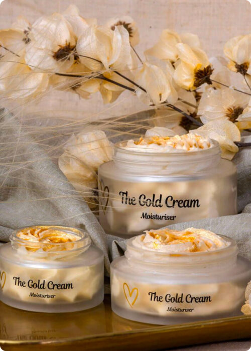
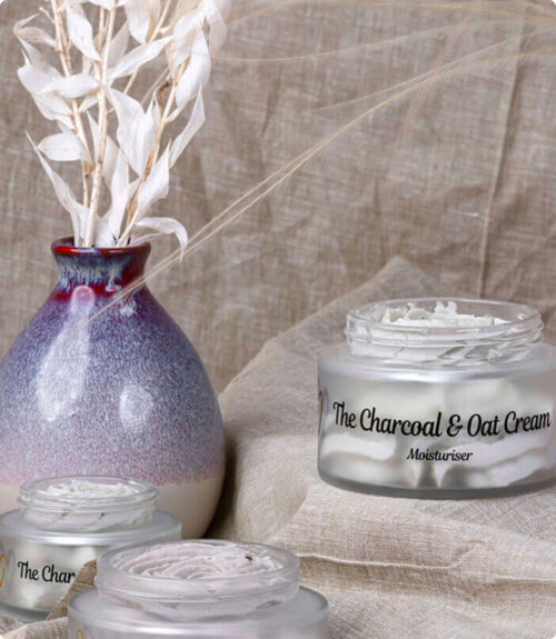
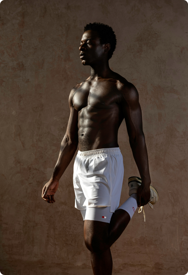
- High quality image production
- Email marketing
Illustration
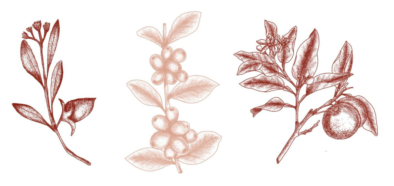
Building on the brand guidelines, we designed bespoke illustrations for use on graphic materials, the website and social media. Our main aim was to spotlight the natural tone of the brand through a raw and ethical look. Other creative elements focused on highlighting the vegan and ethical unique selling points. Our team sought to translate the caring, friendly relationship Zoe has with her followers through graphic design, personifying the idea of a close-knit community.
UI/UX Design
Zoe Bee tasked us with designing and developing a website inspired by pastel, earthy colours and the brand’s organic product. Using simplistic but bespoke iconography that embodied the simplicity of the product, we aimed to showcase the brand as organic and natural, as opposed to pharmaceutical or chemical. With illustrations inspired by botanical artwork, our focus was to maintain the functionality of the website while enhancing the branding to create better brand recognition.
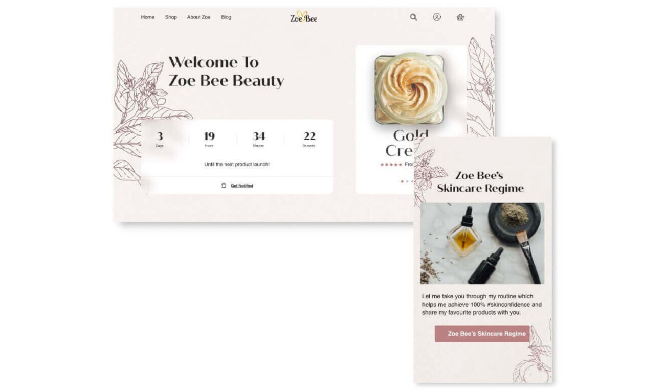
As Zoe is the face of the brand, we wanted to emphasise first person communication, employing a tone of voice that would effectively convey Zoe’s values to her community. The new website needed to better communicate the restocking method, so we designed a ‘countdown’ element for the homepage which also linked to a newsletter sign up form. This in turn allowed Zoe Bee to maintain regular communication between the brand and customers. Over two months, organic traffic increased by 213% and organic traffic value increased by 560%.
Photography
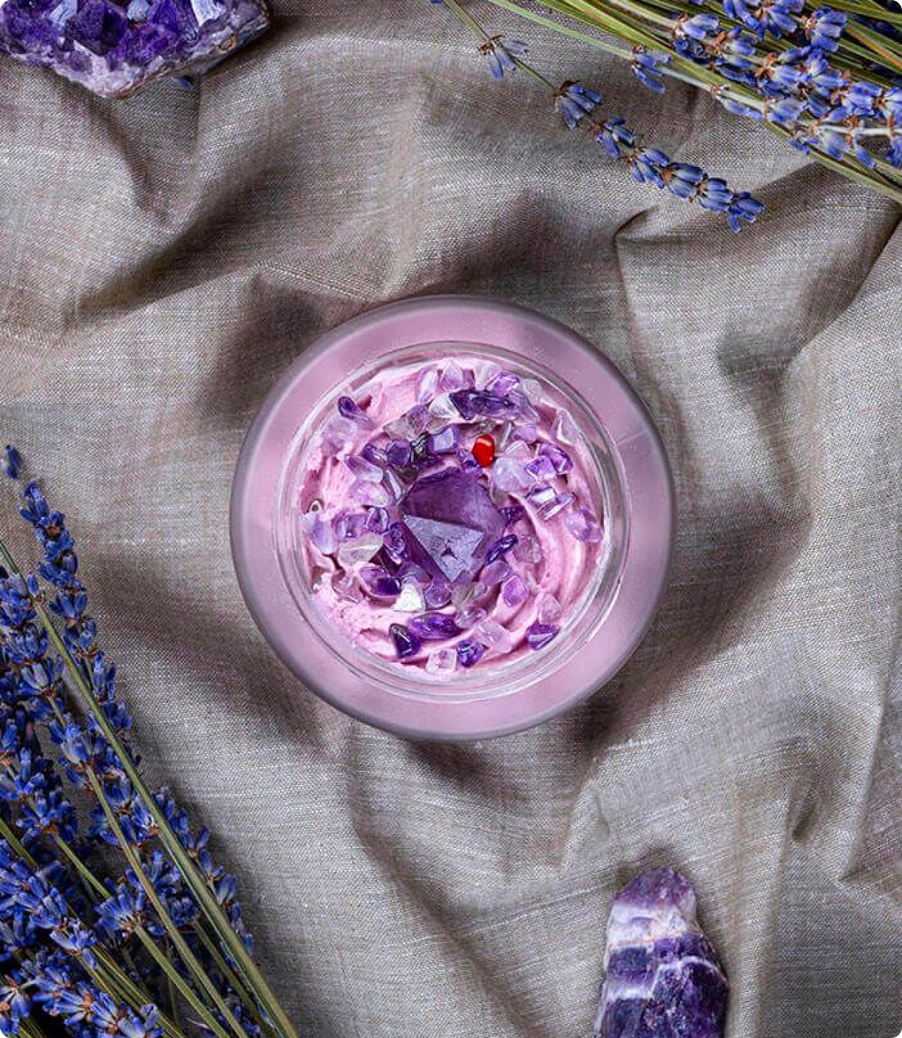
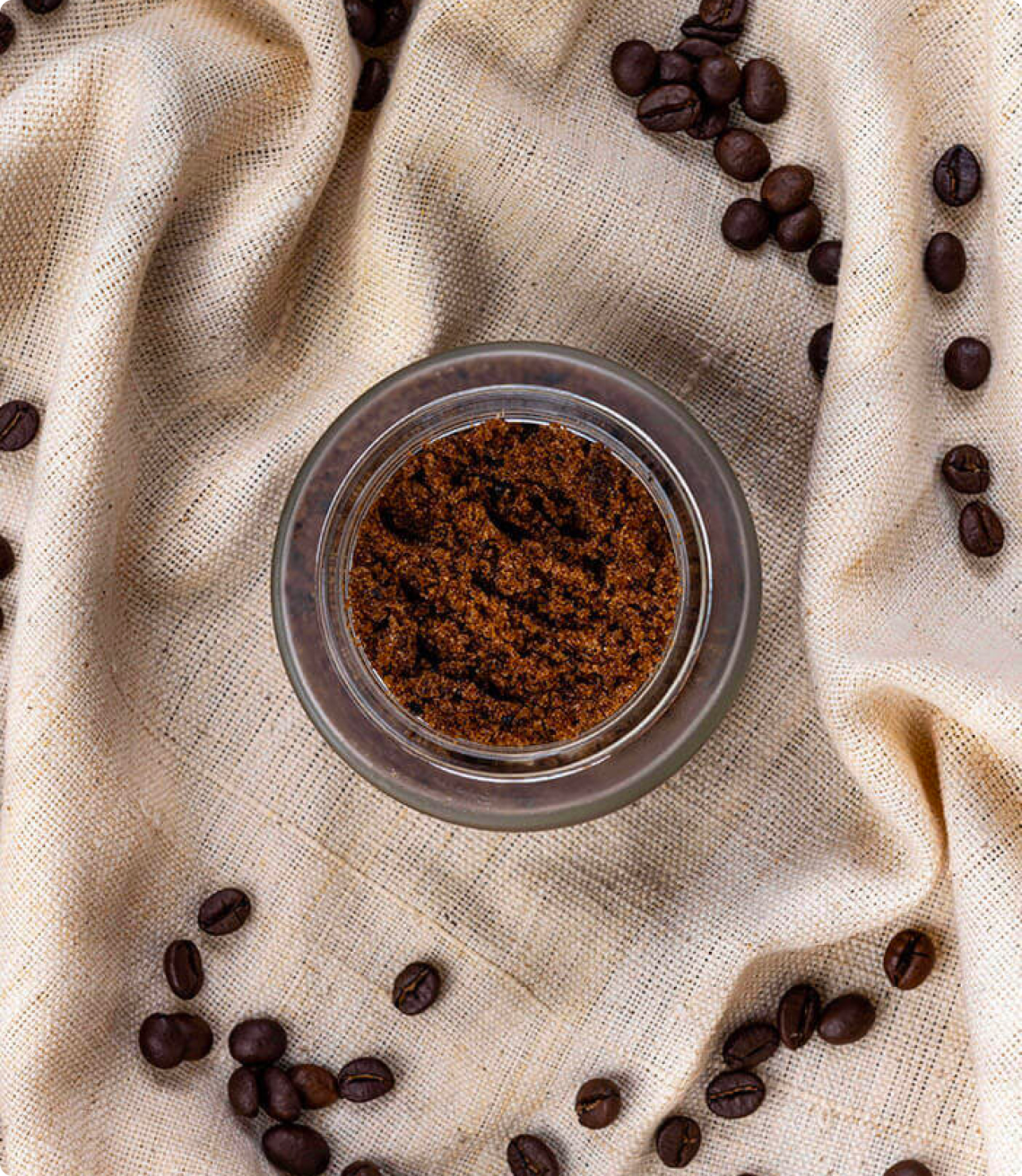
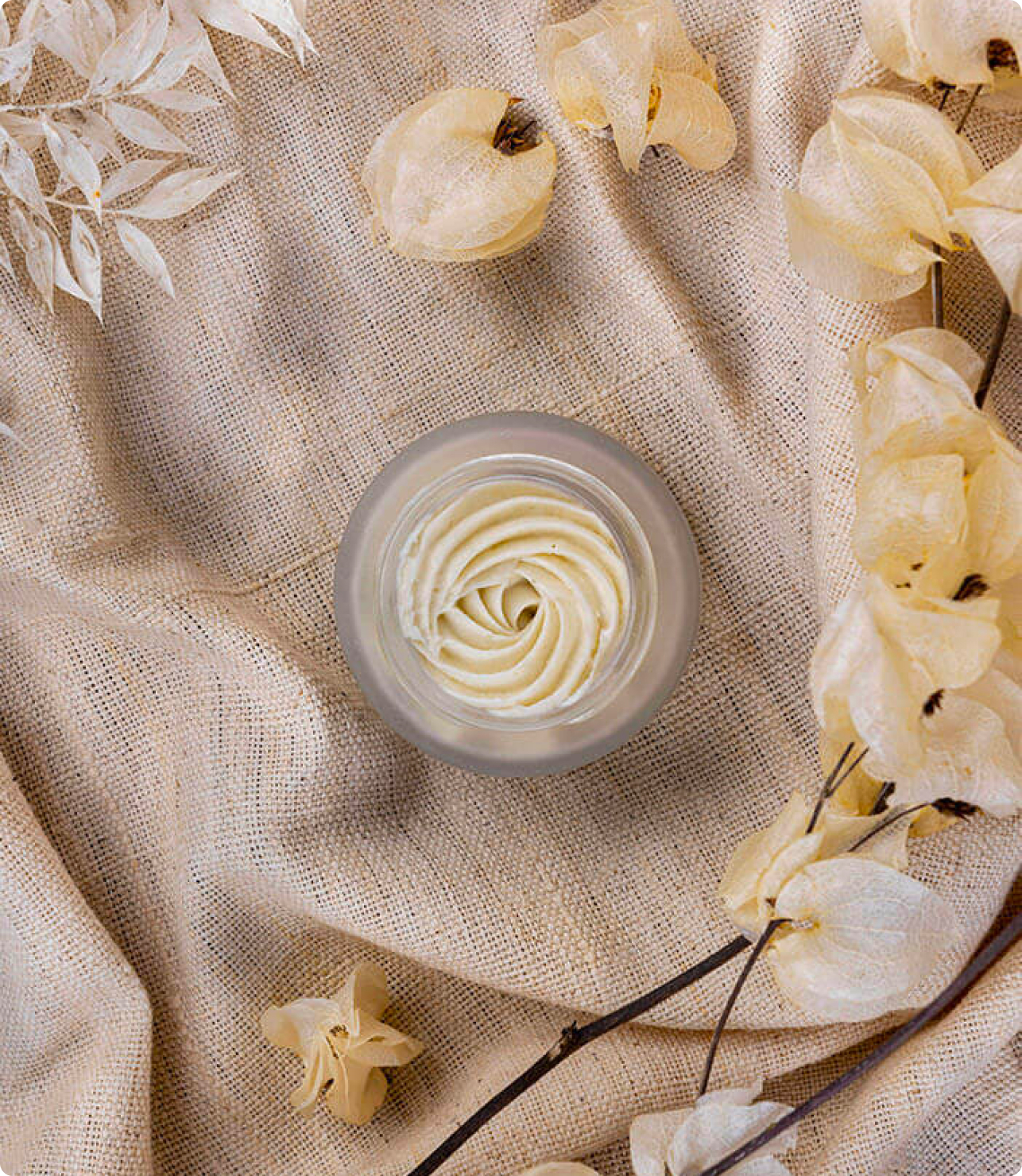
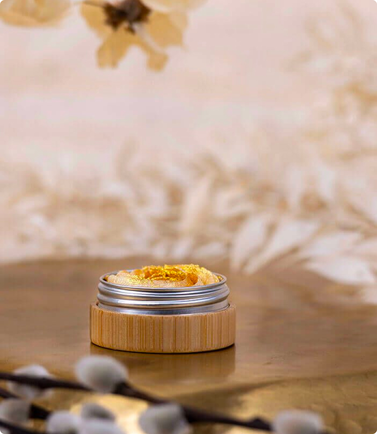
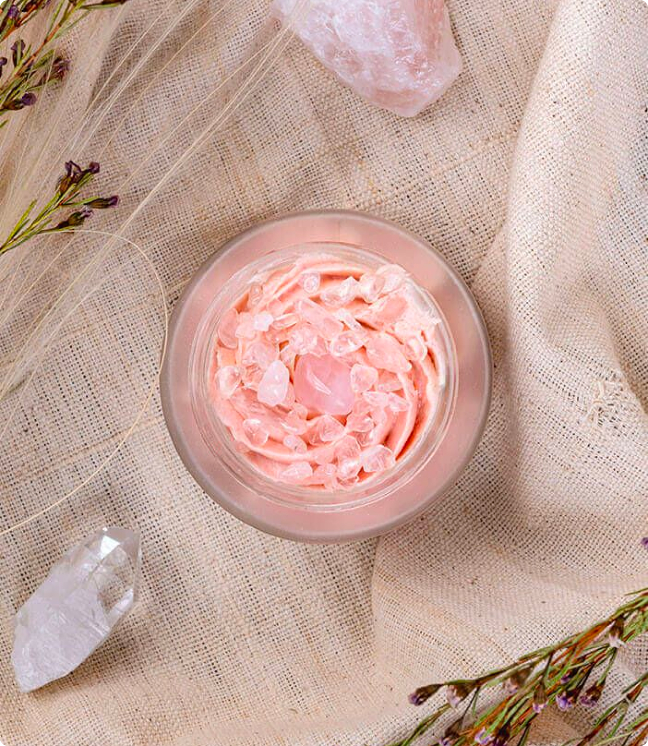
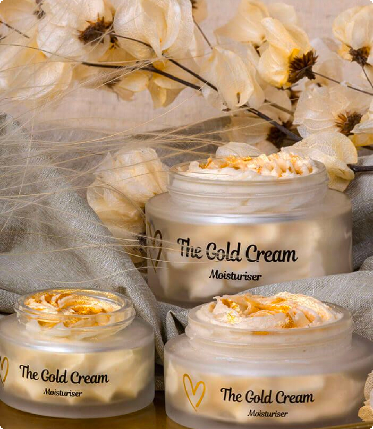
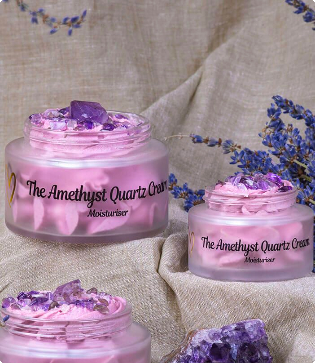
This photoshoot was designed to produce complementary content for the ‘I Am Zoe Bee’ video we shot. The focus was photographing Zoe across lifestyle and portraiture. This formed the basis of a huge archive of photo content for Zoe, the factory and her lifestyle, that could be used across the website, social media channels and for PR.

Email Marketing
We were tasked with creating a buzz around joining the waiting list that would notify consumers of the next Zoe Bee product drop. We created intriguing email newsletters for Zoe’s vastly expanding audience, designed to be personal, informative and compelling.
Ensuring the emails were on-brand, we relaid key information to increase sales, using restock reminders on a weekly basis, employing Zoe’s tone of voice. Our embodiment of the brand meant that we were able to increase both Zoe’s social following and customer purchasing.
Print Design
Due to high demand, Zoe Bee’s products tend to sell out quickly, often leaving a large portion of customers unable to purchase. This is something consumers weren’t too happy about, which was an issue we wanted to address in the right way. Our plan was to shift the focus of how rare Zoe Bee creams are from a negative to a positive through personalisation of the customer experience. Our team designed a leaflet to be placed in each box that would strengthen the link between Zoe and her customers.
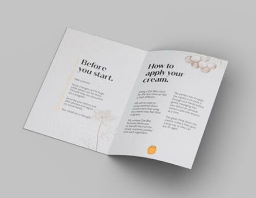
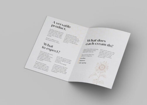
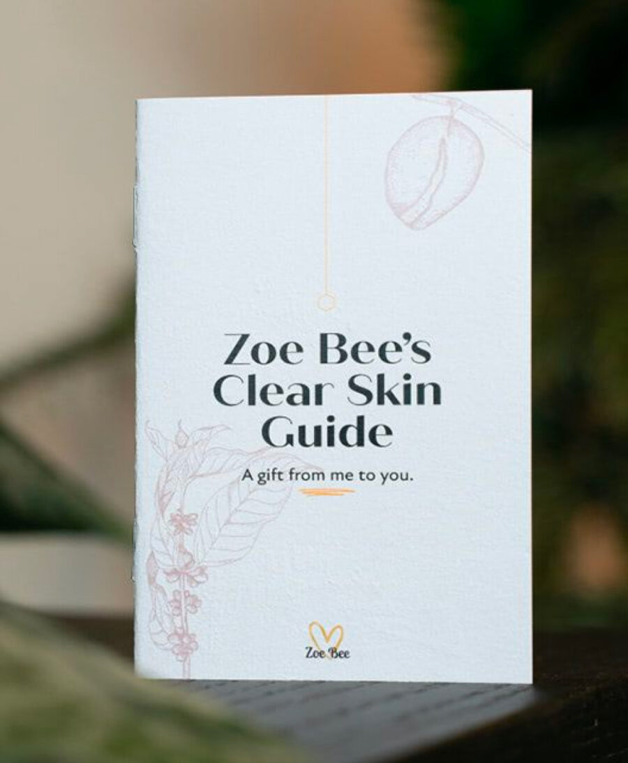
The purpose of the leaflet was to inform customers of the benefits of different creams and address recurring queries, such as how to apply the product. From a design perspective, we created the leaflet to reflect the ethical brand mission and values. We utilised the illustration we developed as the main graphic element on the leaflet. This was designed to make the process of receiving an order a truly unique experience, so that customers feel lucky to have been able to purchase the product.
The purpose of the leaflet was to inform customers of the benefits of different creams and address recurring queries, such as how to apply the product. From a design perspective, we created the leaflet to reflect the ethical brand mission and values. We utilised the illustration we developed as the main graphic element on the leaflet. This was designed to make the process of receiving an order a truly unique experience, so that customers feel lucky to have been able to purchase the product.
Graphic Design
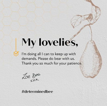
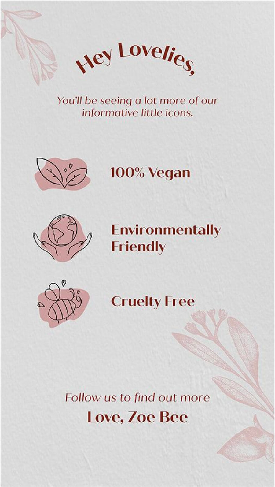
To enable wider use of graphic assets across diverse materials, we designed new assets for the brand guidelines. The design team developed bespoke iconography to reinforce the idea of Zoe Bee’s exclusive, tight-knit community. We wanted to convey the natural pure element of the brand on social media.
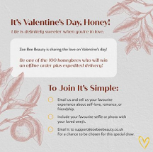
The team achieved this by developing Instagram story themes using the illustrations we created. Zoe Bee was already actively publishing story content but we wanted to structure this in a more impactful way that would showcase the brand identity.
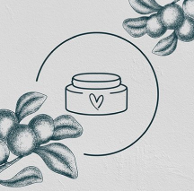
To enable wider use of graphic assets across diverse materials, we designed new assets for the brand guidelines. The design team developed bespoke iconography to reinforce the idea of Zoe Bee’s exclusive, tight-knit community. We wanted to convey the natural pure element of the brand on social media.
The team achieved this by developing Instagram story themes using the illustrations we created. Zoe Bee was already actively publishing story content but we wanted to structure this in a more impactful way that would showcase the brand identity.


