Abbington House
Case Study
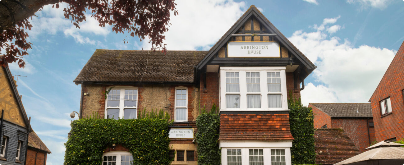
Abbington House is a rehabilitation centre set up by a team of people with years of experience in helping clients to successfully maintain abstinence from substances. The centre is people focused, on a mission to help its clients understand who they really are and live life to its full potential.
The Key Deliverables
- Branding
- Website design
The Challenge
As a brand new facility, Abbington House required a website and branding that conveyed feelings of safety, comfort and recovery without seeming too clinical. Abbington House is unique in its holistic approach, so the branding needed to reflect that. Similarly, the website needed to feel as human as possible, as the centre is built upon the relationship between the team and its clients.
Branding
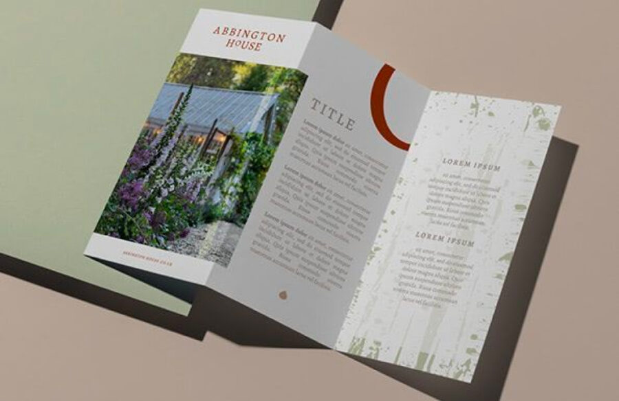
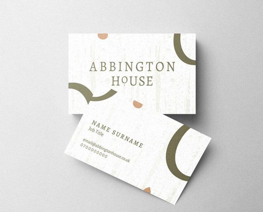
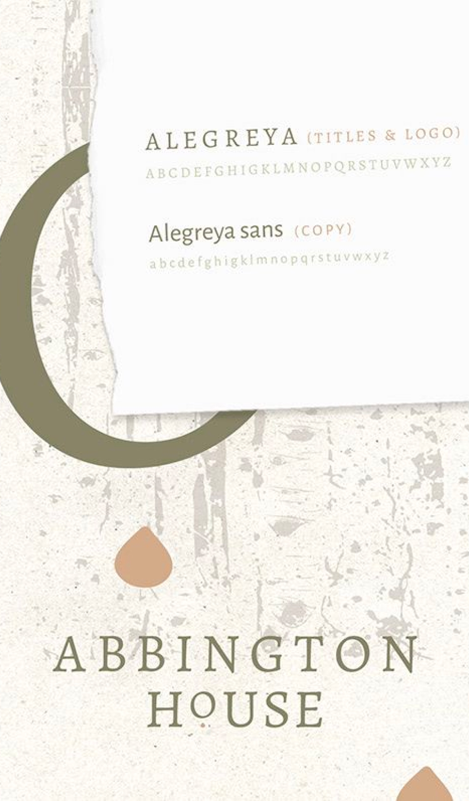
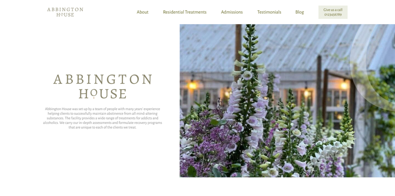
Abbington House is a facility to help fight addiction, so our Design Team wanted the branding to evoke feelings of tranquillity and peace of mind. We selected a soft colour palette, making use of muted natural tones to create a serene atmosphere and foster feelings of warmth. We mirrored this sentiment in the logo, the O shape reinforcing the feeling of a safe cocoon-like environment. We made use of comforting shapes and lines,with the clear space around the logo ensuring maximum visibility and impact. Throughout the design we used the birch tree pattern to personify new beginnings and growth. It’s a sacred tree within Celtic mythology and thought to have protective qualities. We employed this pattern throughout to communicate the safe and healing nature of Abbington House in every aspect of the branding.
Website
The ONQOR Design Team met with Abbington House to determine which design language would best portray the client. Abbington House employs a personal approach, each treatment is bespoke to the client and health professionals are constantly onsite, which is something the website needed to convey.
Website visitors must speak to a member of the team in order to make a booking, so the CTAs needed to invite the user to speak to someone from the team. After scoping out the content for the site, our designers created some loose wireframes to ensure the user journey suited the needs of the site. The team then created a variety of design options for the website. The final stage involved UI wireframing, adding in the copy and the content.
Our DevHub created the website using WordPress CMS. The team used ACF custom fields, providing the client with editable blocks in the CMS which they are able to move and adapt as they wish. The code was written in HTML, SCSS, PHP and the site tested on both mobile and desktop to address any errors.

